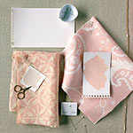
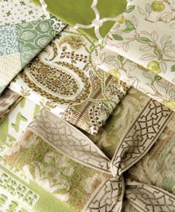
Start your fabric decorating with a color palette. Start with the color you love and then move to fabric pattern, the scale and how much of it you have decided to use. Remember not all patterns have to be the same scale. Don’t be afraid to mix it up a bit, from florals, plaids, stripes even damasks. Let your imagination run.
Think about the color you love and remember choosing a color has a mental and physical response. Close colors on the color wheel are analogous that will make the room calm. Colors farther apart the color wheel are complementary and adds drama. Whether you choose bold shades or muted ones, it’s all based on your liking, mix and match, its ok. Just remember to stay within the 3 basic categories of color.
Next look at the fabric its self, the content. There are literally dozens of materials today’s designer fabrics are made of, it’s you that has to make the decision of what it will be used for. Check out our Fabric Glossary to determine what fabric content will best suit your needs.
Browse these suggestions of fabric colors and ideas to discover fresh new fabric color palettes. Customize your color scheme to suit your decorating taste.
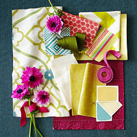
Color palette: blue + yellow + pink + green
The colors of a perfect sunrise come together in this color palette. The flourishes of yellow and pink against blue bring life to a room.
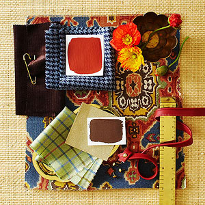
Color palette: cream + brown + red
Create a calming retreat with wools, velvets, and grass cloth and warm, rich reds and browns.
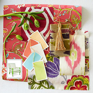
Color palette: melon + blue + green –
Bring an exotic, global look to your home with colors inspired by vibrant Marrakech.
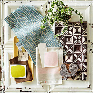
Color palette: white + gold + brown –
White is anything but boring when it is a canvas for rich brown and gold, slate blue and soft pink.
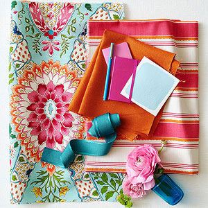 Color palette: blue + pink + orange + white –
A dull room is much like the doldrums of winter. Add life to a room with a palette of sky blue and bright pink and orange.
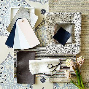 Color palette: gray + blues + pink –
Cool grays and blue alongside soft pink and white play out in a mix of materials that offer a forward-thinking, yet oh-so-livable design scheme.
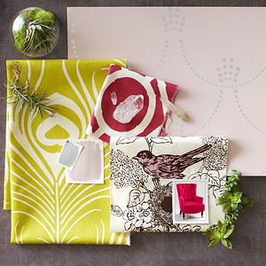 Color palette: lavender + citron + raspberry –
Contrasting colors set a dynamic tone in this palette. Soft mauve and silver temper juicy citron and raspberry for a look that’s fun and feminine.
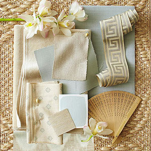
Color palette: ivory + blue + gray –
Elegant textures in soft ivories, blues and grays comprise a timeless palette that exudes beauty.
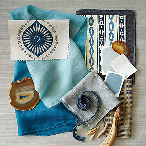
Color palette: blend of blues –
Beautiful shades of blue and gray unite to form a soothing palette that is livable and relaxed.
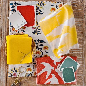
Decorating with red takes confidence. This attention-getting combo benefits warm, easy-to-live-with color.
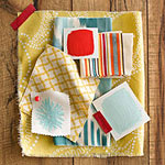
An energizing palette of aqua, yellow and poppy creates a youthful color combo.
Soft, yet hardly saccharine, rose pink strikes the right balance between beauty and substance in decor.
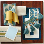 Color Palatte: Watercolor Blue
Accents of yellow and green, classic blue in watercolor hues make a room feel updated and fresh.
From celadon to kelly, mint to forest, green is as varied as it is versatile. By incorporating green into your color schemes with inspiration it creates an overall look that’s quaint yet classy.
Resource: Better Homes and Gardens

